Dojah - Reimagining identity verification for Africa.
Designed the systems that help businesses build trust, beat fraud, and onboard customers seamlessly

Role
Lead Product Designer
Timeline
10 weeks
Team
3 Engineers, 1 PM, 1 Product Designer
Platform
Web
Background: An abstraction layer over Africa's messiest data problem
Dojah is an Identity-as-a-Service (IDaaS) platform. In the African market, identity verification is notoriously difficult because the underlying data is siloed, government databases, telecoms, and financial institutions each store and expose identity data differently. Dojah acts as an abstraction layer, taking these disconnected, inconsistent sources and turning them into one clean API a developer can integrate against.
THE PIVOT
Dojah began as a simple tool for checking a National Identity Number (NIN). As compliance requirements across the market matured, the need shifted from a single-purpose tool to full infrastructure — NIN, BVN, AML, biometrics, and document checks under one roof. I was brought in to lead design on this 2.0 version: turning a narrow utility into a modular platform businesses could build their entire verification stack on.
The challenge: The last mile of verification
Dojah's previous product worked, but it was narrow, and it was starting to show its limits as the company's ambitions grew. The real design problem was serving two very different people inside the same interface: a developer who wanted power and control, and a compliance officer who just needed a decision they could trust — without either one working around the other.
Expanding the feature set — AML, biometrics, document analysis — without the navigation becoming harder to use than before.
Balancing design depth against a fixed delivery timeline, with no room to redo foundational decisions late.
Collecting real user feedback quickly enough to act on it, rather than shipping and hoping.
Designing around live constraints of emerging-market data sources — sources that are slower and less reliable than a typical Western API.
People were dropping off at every step of onboarding
This wasn't one broken screen — it was the same failure repeating across document capture, the selfie/liveness check, the wait for a result, and the personal details form. At each step, customers weren't sure they were doing the right thing: which document to use, what angle to hold it at, or whether a long pause after submitting meant the system was working or had simply frozen.
Reviewers were missing fraud that was sitting in plain sight
On the other end of that same funnel, reviewers manually cross-checked a verified customer's data — BVN, NIN, phone, driver's licence — against each other. All of it lived on one screen, but nothing visually distinguished a field that matched from one that didn't. A mismatch was exactly as easy to miss as it was to catch, and when one slipped through, it surfaced later, usually as a support escalation rather than being stopped at the point of review.
Two audiences, two different symptoms — but the same root cause: people were expected to notice things the interface wasn't telling them.
Starting from what users already knew
Before redesigning anything, the goal was to understand what was already working for existing customers, and what prospective ones were missing entirely.
Existing user interviews
Spoke with current Dojah customers and their compliance teams to understand day-to-day friction with the live product, not hypothetical friction.
Focus group on current functionality
Analyzed how existing features were actually being used, to keep what was already valuable rather than redesigning it away.
Prospective user interviews
Talked to businesses evaluating Dojah for the first time to understand what expanded verification and AML capability would need to look like to win their trust.
Competitive analysis
Benchmarked against the other identity infrastructure players operating in the same market — Okra, Smile-ID, VerifyMe, and YouVerify — to understand where Dojah was strong and where it had real gaps.
Platform | Core strength | Best suited for |
|---|---|---|
Dojah | Multi-source identity verification connecting telco and government data | Businesses needing broad verification capability — e-commerce, insurance, fintech |
Okra | Open banking APIs with real-time bank-to-bank data access | Lending, fintech, and personal finance products |
YouVerify | Regulatory compliance — detailed KYC, AML, and address verification | Financial services needing on-site document verification for data reliability |
Smile-ID | Biometrics and liveness detection | High-security use cases — telecommunications and government services |
Visual Design
Observed how competitors used design choices to signal a modern, professional aesthetic — a trust signal in a category where trust is the entire product.
User Journeys
Compared onboarding and transaction flows across platforms to identify where efficiency could be won or lost.
Market Gaps
Identified where competitors offered unique value Dojah didn't yet — and where Dojah's multi-source depth was a genuine differentiator worth designing around, not against.
How I approached it
The same five-step process applied to both sides of the problem — always starting from where a real person was getting stuck, not from the interface.
01: User journeys and key flows
Mapped detailed journeys for the core flows — account setup, identity verification, AML review, document uploads — marking every point where a customer or reviewer had to guess rather than being told.
02: Sketching and low-fidelity wireframes
Used initial sketches and low-fi wireframes to map core screens and test whether a flow worked at all, before any visual design existed to bias the feedback.
03: Clickable prototypes
Turned wireframes into clickable low-fi prototypes for early user testing, allowing fast iteration based on real reactions rather than assumptions.
04
Design system
Established the Dojah style guide alongside the mid-fidelity screens, so layout and interaction decisions were made once and reused consistently rather than re-litigated on every new screen.
05
Testing and iteration
Ran structured testing with a small focus group across the onboarding, verification, and quick-action flows — then iterated on navigation, intuitiveness, visual clarity, and feature discoverability based on what came back, before moving to final high-fidelity screens.
Working within the deadline
As the sole designer, sequencing the work was itself a design decision — there was no team to split the two problems across, and a fixed delivery timeline meant not everything could be rebuilt at once.
Trade-off
Because drop-off was compounding across every step of onboarding, fixing instructions and feedback across that funnel took priority over rebuilding the reviewer dashboard from scratch. The reviewer-side flagging system followed once the onboarding fixes had shipped, rather than launching both at once.
That sequencing reached the highest number of people first — but it also meant reviewers kept working with the old, undifferentiated data view for longer than was ideal while the second phase caught up.
Some of what actually shipped
A dashboard built around the way verification actually happens — case by case, flag by flag — plus a marketing site that translates that trust into a reason to sign up.
Easy Onboard
Redesigned the onboarding flow for new users end to end, reducing steps and clarifying exactly what to do at each one.
Dashboard structure
Reorganized the dashboard around task priority, introducing Quick Actions for the most common jobs instead of burying them in navigation.
AML integration
Built specialized flows for AML compliance — identity checks, sanctions list, and watchlist monitoring — as first-class parts of the review process.
Verification services
Incorporated document verification, facial recognition, and biometric authentication into one consistent review pattern.
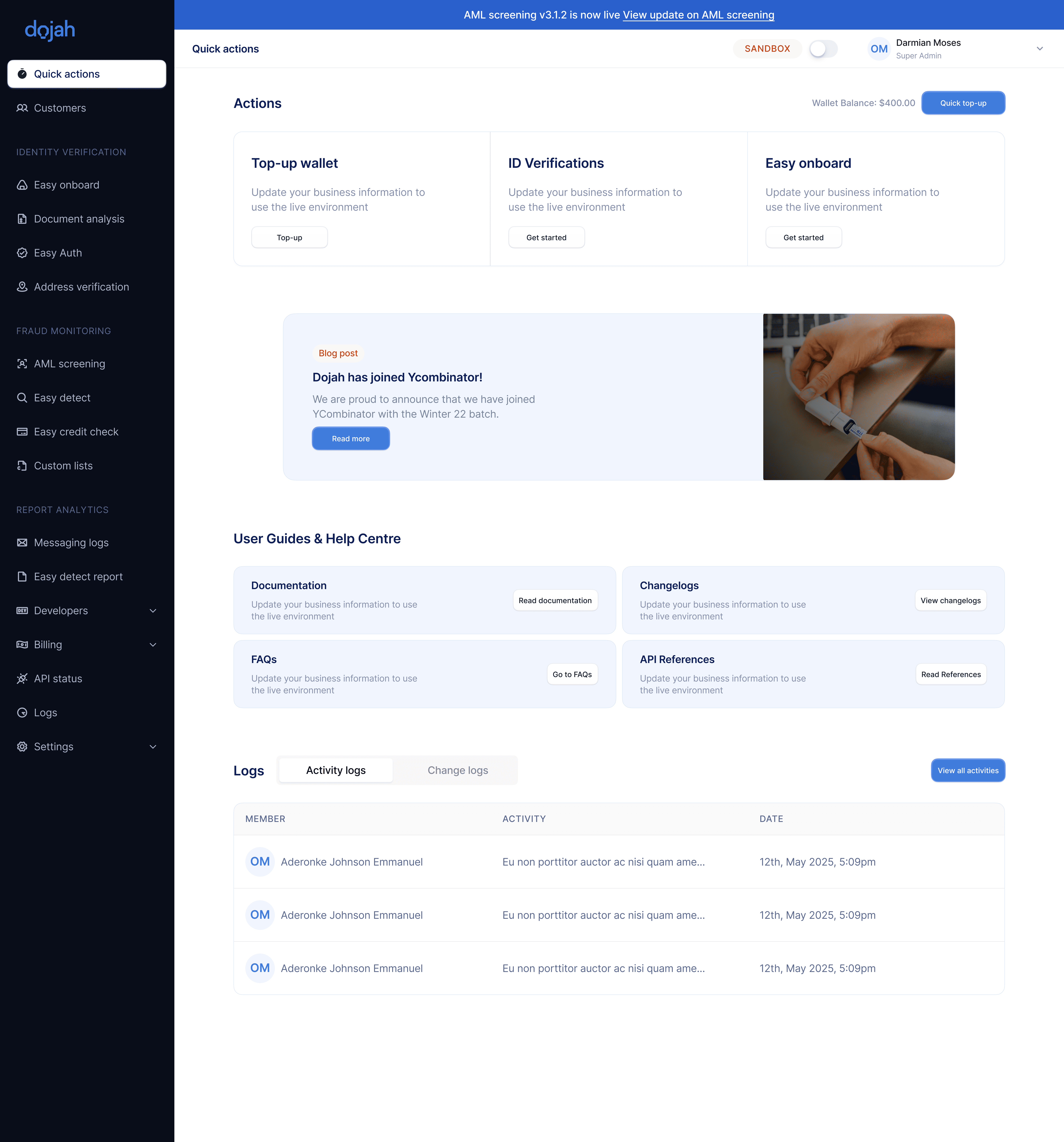
Quick actions
The landing view inside the product — surfacing the next action a business needs to take instead of burying it behind navigation, alongside recent activity and documentation.
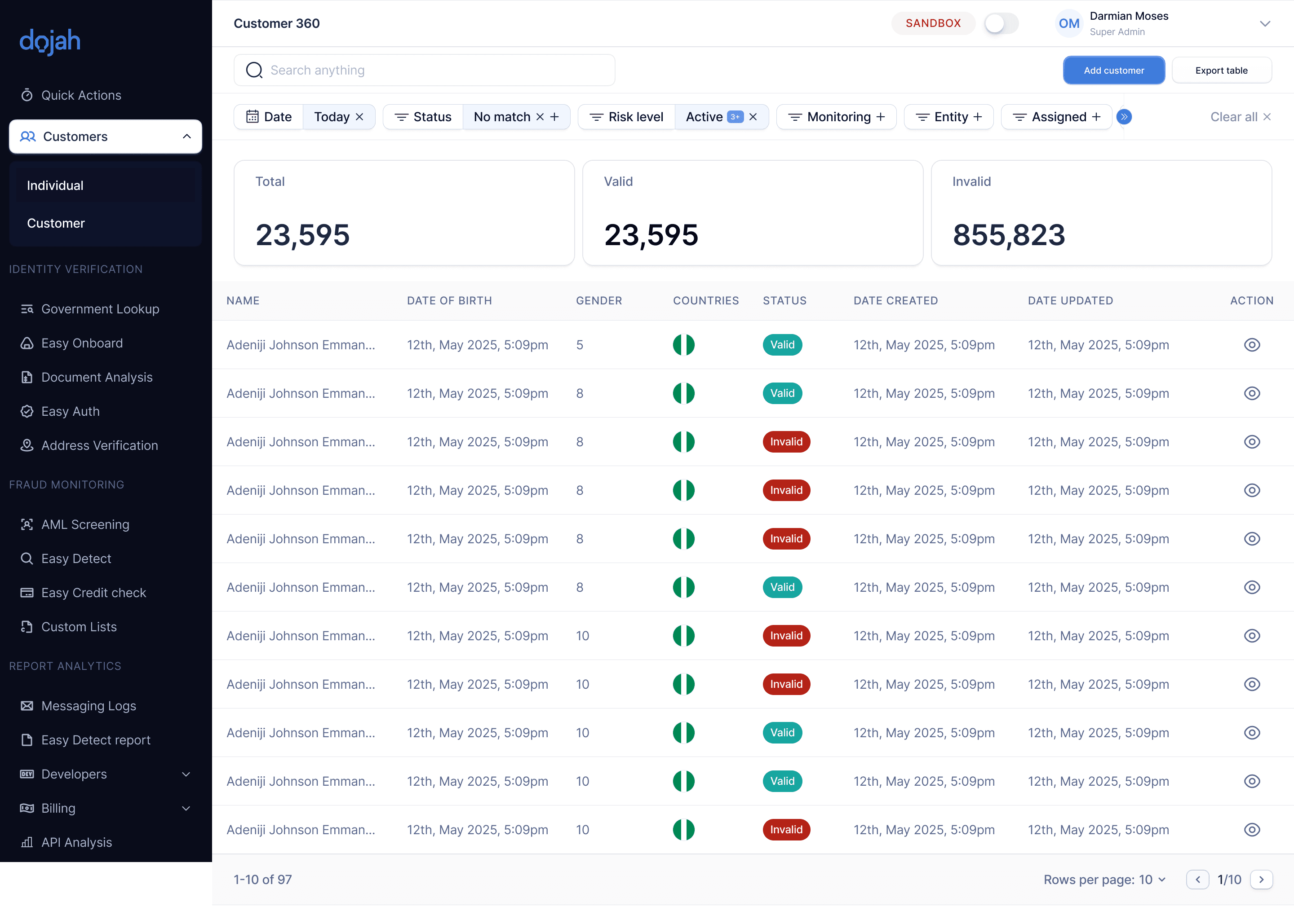
Customer 360
A single view of every customer a business has verified, with valid/invalid status, risk level, and monitoring filters — designed so a reviewer can scan hundreds of records and spot the ones that need attention.
Individual lookup
Drilling into a single customer surfaces every data point pulled across government sources with mismatches flagged inline instead of left for a reviewer to catch by comparing fields manually.
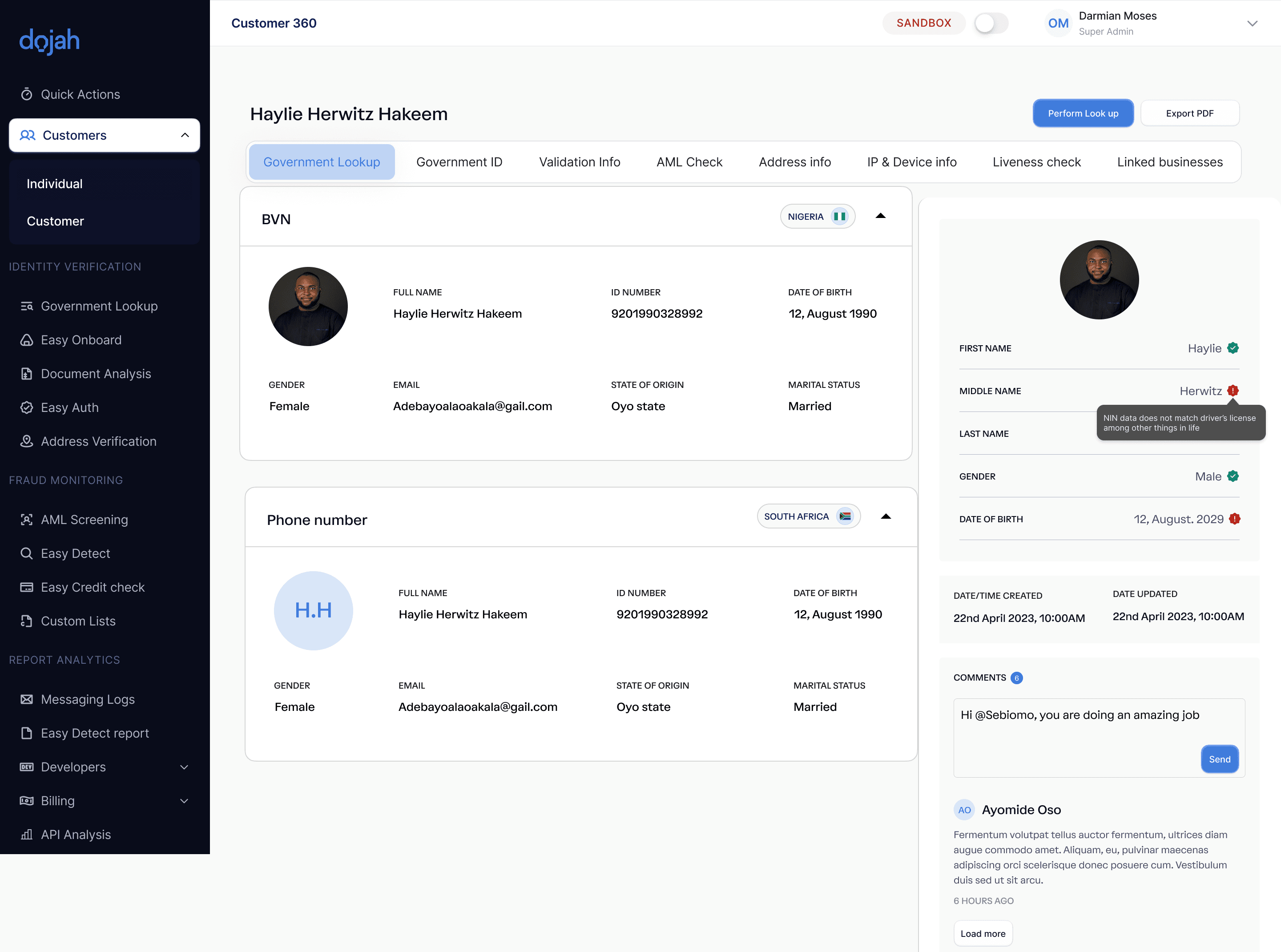
That red flag on "Middle name" reading NIN data does not match driver's licence is the exact kind of mismatch that used to depend on a reviewer noticing it themselves — now it surfaces automatically, with a comment thread so the team resolves edge cases together instead of losing context.
Business 360
The same flagging pattern reused for verifying companies rather than individuals — one consistent signal to trust regardless of what's being verified.

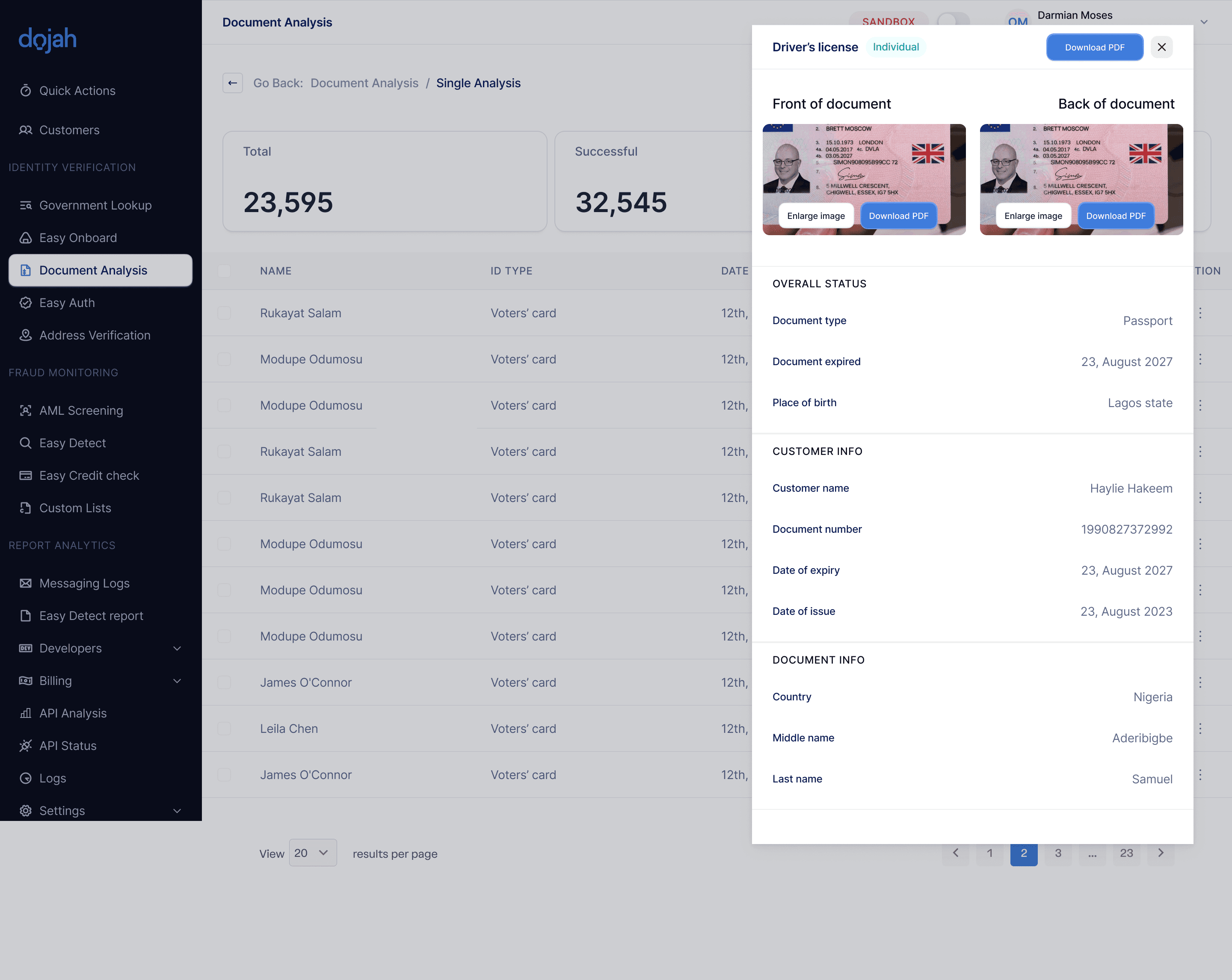
Document review
A focused panel for reviewing an uploaded ID document — front and back side by side, with status, expiry, and extracted fields laid out so a reviewer never has to hunt for the detail that matters.
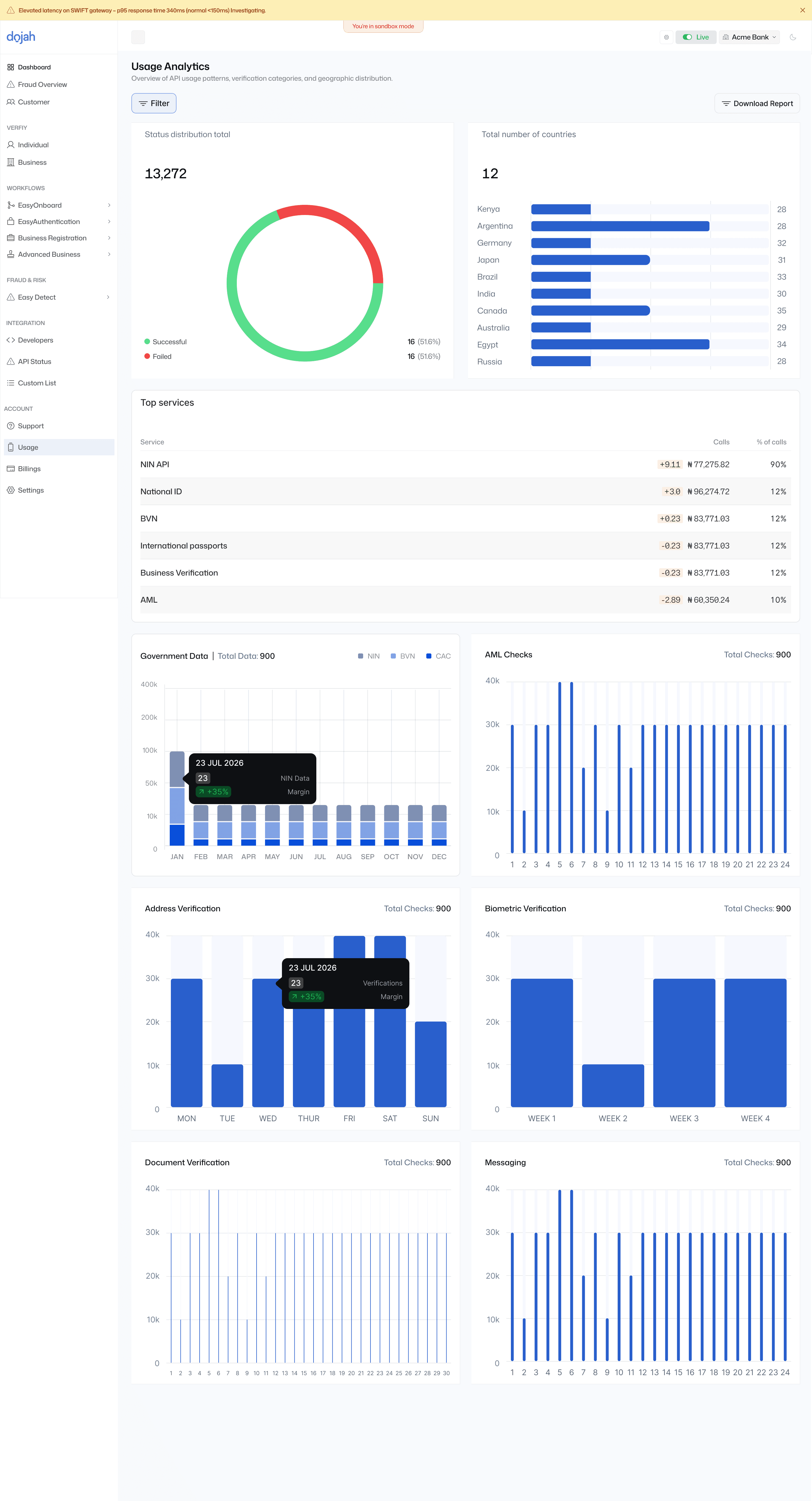
Usage analytics
Giving businesses visibility into their own usage — success rates, top services, geographic spread — so the dashboard doubles as a way to understand cost and performance, not just run individual checks.
Design challenges and solutions
Two problems that needed more than a UI fix
Some parts of this project weren't solved by better layout — they needed a different underlying interaction model entirely.
01 — Solving for the "pending" state
A 30-second wait looked exactly like a crashed app
Identity lookups in emerging markets are slow — government databases and telco lookups don't respond instantly. In the old design, that delay was represented with a generic spinner, so a normal 30-second wait was indistinguishable from a broken request. Customers refreshed, resubmitted, or gave up entirely.
THE FIX — STATUS-AWARE INTERFACE
Instead of a generic loading state, the interface reflects exactly what stage the verification is at as it happens — for example, showing that step one of a lookup has been received before moving to the next stage of checking a government database — so waiting has visible, incremental progress instead of silence.
The transparency reduced the anxiety that was driving customers to refresh mid-check — directly addressing the "is this frozen?" moment that was one of the biggest single contributors to drop-off during onboarding.
02 — Human-in-the-loop review
Machine matching isn't always confident enough to act alone
Automated checks — like matching a selfie to an ID photo — aren't always certain. When a match comes back with moderate rather than high confidence, a human still has to make the final call. The old review screen gave reviewers the raw data but no help understanding why something needed a second look.
THE FIX — MANUAL REVIEW QUEUE WITH SURFACED EVIDENCE
Rather than asking a reviewer to spot the issue themselves, the interface surfaces the specific reason a case needs review directly — the exact field that doesn't match, or the exact reason a biometric match came back uncertain — so the reviewer's job becomes confirming a flagged reason, not hunting for one.
This is the same inline-flag pattern visible in the Customer 360 screen above — built specifically so a decision that used to take real cross-referencing takes seconds instead.
The craft — developer experience
The UI had to be as powerful as the code
Dojah is an infrastructure product — most of its power is consumed through an API, not a UI. Reaching a world-class standard meant designing the dashboard to feel like it belonged to the same product as the API, not a separate afterthought bolted on for non-technical users.
A split-view API console
For developers testing integrations, I designed a split-view layout: the visual result of a verification on one side, the raw JSON response on the other. It lets a developer confirm a request worked correctly and see the exact data structure they'll be working with, side by side, instead of guessing at the response shape from documentation alone.
Modular verification cards
Every verification type — NIN, BVN, liveness — was designed as a modular card rather than a fixed step in a rigid flow. Developers can compose their own verification sequence by arranging these cards in whatever order fits their product, instead of being locked into one predefined path.
What changed
The redesign changed how quickly and confidently businesses could verify a customer — and how few problems they ran into along the way.
↓ Faster
Key verification time for compliance operators dropped noticeably after the review-flagging redesign.
↑ Completion
Onboarding completion rate for new business sign-ups improved after the pending-state and instruction fixes.
↑ Adoption
Feature adoption of AML and watchlist tools grew in the months following launch.
↓ Dev time
The new design system cut the time engineers spent hard-coding UI from scratch on new screens.
Reported directionally rather than as audited figures — the underlying trends were consistent and noticeable across support, product, and engineering, even without a formal measurement study attached to this specific redesign.
✓Fewer customers dropping off mid-onboarding — clearer instructions and real-time progress meant fewer people abandoning the flow out of confusion rather than choice.
✓Faster resolution when issues did occur — flagged mismatches were caught at the point of review instead of surfacing later as support escalations.
✓Fewer customer complaints — support tickets related to ID verification issues dropped following the redesign.
✓More businesses onboarded — a clearer, more trustworthy experience contributed to growth in active businesses on the platform.
Reflection
What this project actually taught me
Being the sole designer on both ends of the same funnel meant I couldn't treat the customer experience and the reviewer experience as separate projects — the fix for one was incomplete without the fix for the other.
The deadline forced a sequencing decision I stand by: solve the problem reaching the most people first, even knowing the second half of the fix would have to follow rather than ship alongside it. Naming that trade-off honestly is more useful than pretending both halves shipped as one clean release — and it's the kind of prioritization call I'd make the same way again.
A product that has to earn trust in seconds, designed to hold up under scrutiny.
Working as the sole designer across the dashboard and the website meant every decision — from an inline flag to a homepage headline — had to reinforce the same thing: that Dojah is precise, and that precision is visible the moment you use it.
Tariq